SAP Business Network
Purchase Order
Project Details
Project Title: SAP Business Network Purchase Order Enhancement (Phoenix Project)
Duration: May 2023 – Jan 2024
Role: Design Lead (End-to-End Designer)
Goal
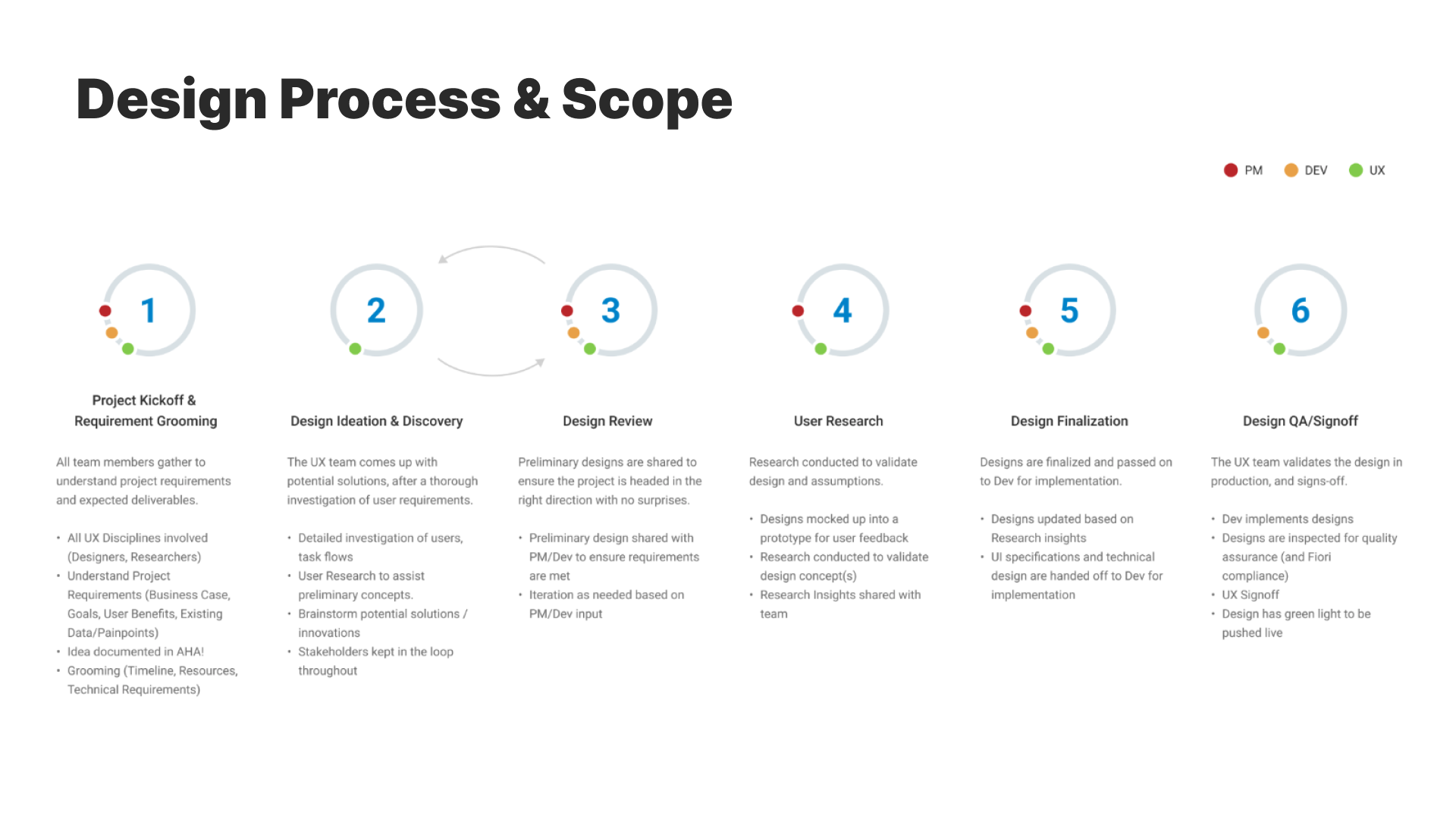
Approach

Conducted interviews with procurement teams and surveyed buyers and suppliers to identify key issues.
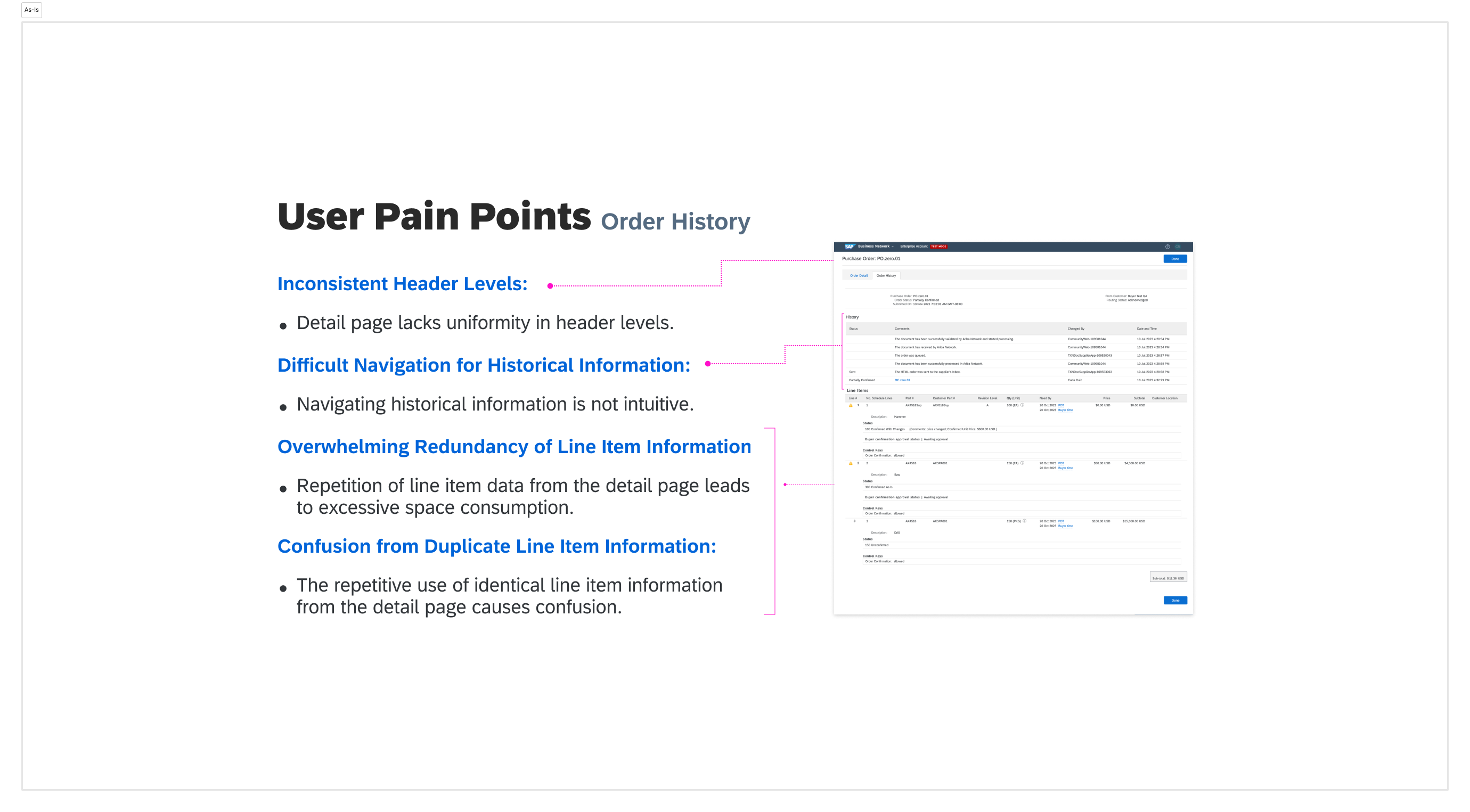
↪ Focused on understanding pain points in managing POs, such as difficulty navigating historical data, redundant line items, and inconsistent layouts
Analyzed how the PO page was displayed across Mac and Windows platforms. Iterative testing revealed discrepancies in font rendering, alignment, and layout functionality.
Data Analysis
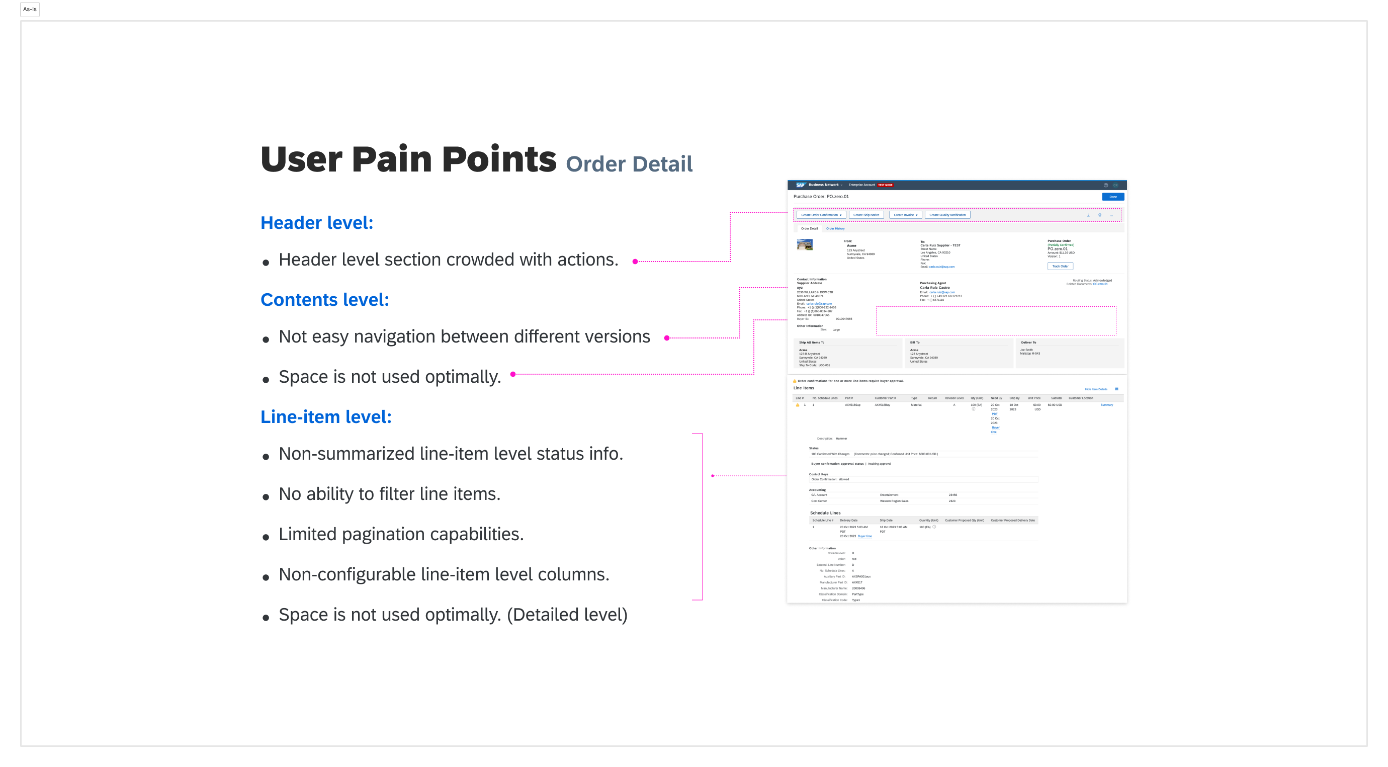
Findings from SAP BN’s reports and user feedback highlighted recurring issues:
- 1. Inconsistent Headers
- Headers were overcrowded with actions, confusing users.
- 2. Line Item Redundancy
- Repetitive data entries consumed space and reduced clarity.
- 3. Lack of Accessibility
- Limited RTL (Right-to-Left) language support hindered usability for global users.
- 4. Outdated Design
- The design failed to meet modern user expectations for navigation and clarity.
Existing Problems
1. Lack of Cross-Platform Consistency
2. Redundant and Overloaded Information
3. Accessibility Gaps
Problem Statement
Solution Exploration
Ideate
[ Solution Exploration ]
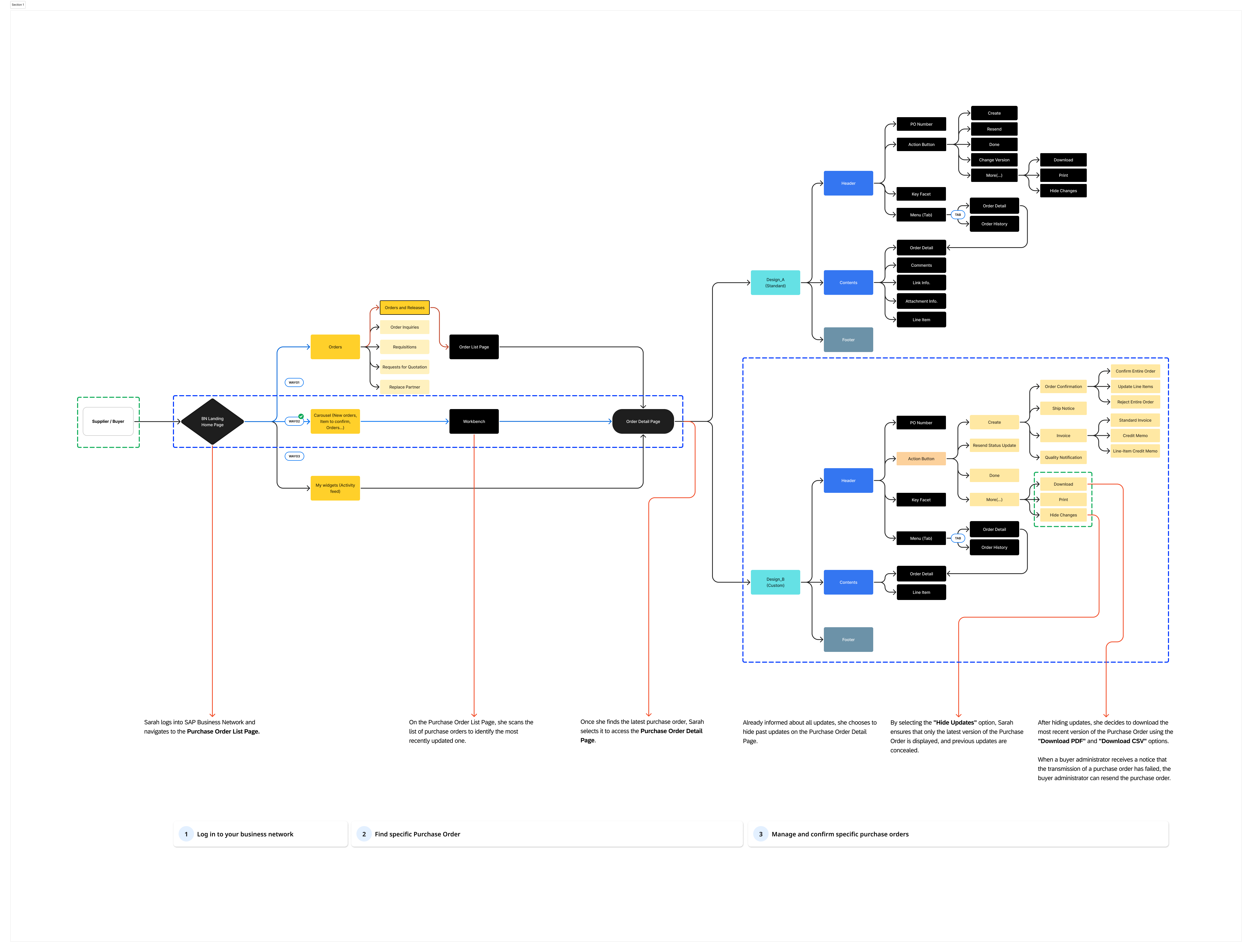
Split Pane Design
- Familiar layout resembling tools like Outlook.
- Vertical navigation improved information organization.
- Requires frequent toggling between panes, which could slow navigation for some users.
Nested Table Design
- Clean, single-window layout.
- Organized data presentation and better use of screen space.
- Slightly less intuitive for first-time users unfamiliar with the format.
Chosen Approach
A hybrid solution combining the strengths of both designs:
Retained for familiar navigation.
Integrated for better data organization and efficiency.
Prototype and Progress
Initial Prototype
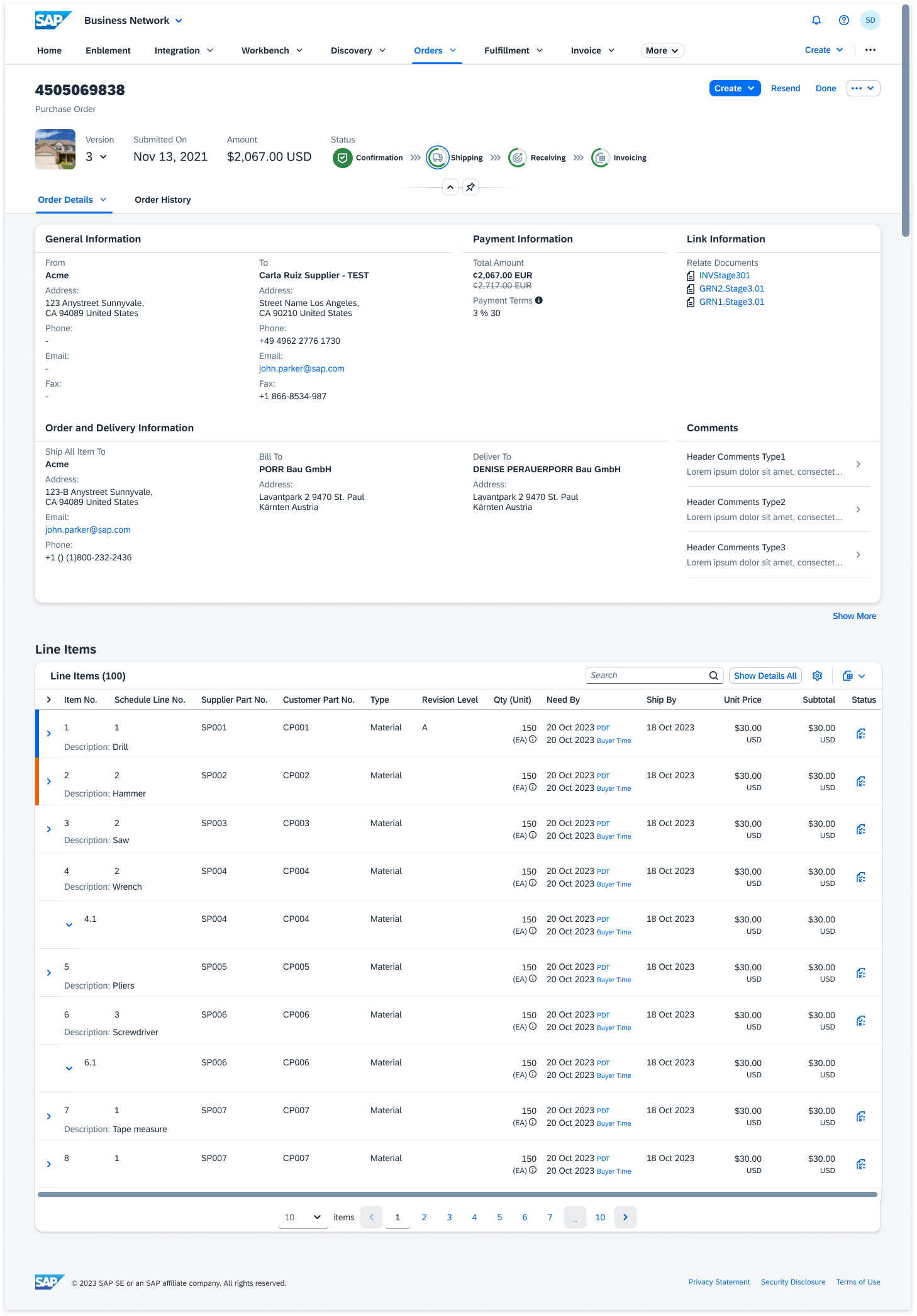
Designed using UI5/Fiori Elements standards.
Included: ↪ Consistent headers, footers, and alignment for cross-platform compatibility. ↪ Simplified navigation elements and streamlined layouts. |
November 2023 |
Enhancements in Progress
Accessibility
–
Implementing RTL support for global users.
Pagination
–
Improving line-item navigation and filtering capabilities.
Dynamic Updates
–
Simplifying the process of viewing and managing PO updates.
|
|
The Synthesis
Testing & Validation
Process Overview
Key Insights from Testing
Users highlighted familiarity, efficient navigation, and better data analysis.
Split Pane Design (41% Preferred)
Users appreciated the cleaner, more organized layout and efficient use of screen space.
Split Pane Design (41% Preferred)
Discrepancies between Mac and Windows platforms were resolved by adjusting font rendering, alignment, and CSS interpretations.
97% consistency across platforms after adjustments, reducing complaints by 15% compared to the initial design.
Testing with RTL (Right-to-Left) languages like Arabic and Hebrew revealed significant comprehension improvements.
20% increase in usability ratings from non-English speaking participants.
75% of users preferred the design with max-line limits, finding it easier to navigate large datasets.
Design B was favored for its concise organization, reducing time spent searching for information by 30%.
Integrated status charts and version tracking were evaluated positively by 68% of users, who found it convenient to see all key information in one place.
- Usability Testing
-
↪ Conducted across 6 participants representing both buyers and suppliers.
↪ Platforms tested: Mac and Windows.
↪ Tools: Click tracking, time-on-task measurement, and satisfaction surveys. - Affinity Mapping
- ↪ User feedback was categorized into strengths and challenges using affinity diagrams to synthesize recurring themes.
- A/B Testing
-
↪ Compared Design A (Split Pane) with Design B (Nested Table).
↪ Results showed Design B preferred by 59%, highlighting better data organization and less scrolling. - Iterative Improvements
- ↪ Adjusted based on feedback to align with user needs, ensuring the final design minimized pain points identified in early testing.
Outcomes
Unified User Experience
Improved Accessibility
Optimized Navigation
Outcomes & Learnings
Achieved uniform layouts and navigation across Mac and Windows platforms.
↪ Impact: Enhanced user satisfaction and reduced confusion.
2. User-Centered Design
Integrated feedback from buyers and suppliers to ensure the design aligned with their needs.
↪ Impact: Improved clarity and reduced support requests related to PO navigation.
3. Accessibility
Implemented RTL support to improve inclusivity for global users.
↪ Impact: Expanded usability across key markets, especially in regions using RTL languages.
4. Streamlined Information Hierarchy
Reduced redundant information and improved clarity in headers and line-item details.
↪ Impact: Enabled faster navigation and reduced cognitive load for users.
